Pages

Wednesday, May 29, 2019

Grade 6 Still Life

"Abstract" Still Life, Zichen.
I have not been a huge fan of traditional Still Life as a subject matter in Art for younger students, so I decided to create a Still Life unit that would both challenge and keep the students engaged. We started out with various life drawing exercises- using students as models, pose-able wooden mannequins and hands, and a few other miscellaneous objects. I timed the drawings in intervals, so we would do 5 minutes, then 1 minute, then 30 seconds. This is supposed to help train the brain and eyes to notice different elements- such as detail and form. Then I set up a table with some simple objects and had the students do a traditional Still Life pencil drawing.  Next, we looked at Still Life from many different eras in Art history, and multiple styles. To coordinate the objectives, Assessment, and Lines of Inquiry, I chose 4 different styles for students to choose from for their Summative Assessment task: Pointillism, Abstract, Pop Art or Traditional. When they had decided on a style, they were asked to do a few simple drawings in their chosen style in their sketchbooks. To differentiate, students were allowed to use any medium available; including soft or oil pastels, colored pencil, acrylic on canvas or paper, pen on paper, or watercolor. They were also allowed to choose what objects they wanted to draw or paint. Most chose some or all of the already set up objects, but some got more creative or changed perspectives.  Here are some snapshots of the process and finished artworks. They are quite amazing for Grade 6!

"Pointillism", Yuqi

"Traditional", Daniel

"Abstract", Dekai

"Pointillism", Flora

"Traditional", Yitong

"Pop/Traditional", Yujia

"Traditional", Claire

"Traditional", Jinqi

"Pop Art/Traditional", Yufei

"Abstract (Cubism)", Nora

"Pointillism", Leo


Working hard at the start of their summative task.


Focusing on details.


Monday, February 25, 2019

Grade 10 Intro to Relief Printmaking

Most of my Grade 10 students have never done printmaking before, let alone had an actual Art class before joining our school. (Apparently this is the norm in public schools here). So, there has been a lot of work to do in terms of basic skills and knowledge building. We spent the better part  of the first semester working on goals and establishing basic Art knowledge. Students learned realistic drawing and life drawing techniques, a bit of Art History, created process journals and made their own small notebooks for daily/weekly sketching.

The last small project we worked on last semester was Beginning Relief Printmaking, since we just got our brand new etching press!  We looked at the history of Printmaking, and made the connection that wood cutting basically originated in China, which was super cool for the students to learn. We looked at different types of Printmaking, including Etching, Monotype, Relief, Lithography and Screen printing. Students came up with a small logo that had some sort of personal meaning, and then we used small square pieces of rubber to learn carving. I did a demo, and then the rest was basically up to them.

Questions of Inquiry ranged from:
Is wet or dry paper best for printing?
How thick does the ink need to be?
How does color choice inform the artwork?
Why did I create this particular image?

In the end, we did a small critique and talked about all of the challenges and victories of the first print "series".  I can't wait to delve much deeper into different forms of Printmaking and see what they come up with!


Grade 7 POP ART PORTRAITS

Grade 7 students have been working super hard on these Pop-Art inspired portraits for their first unit of the year. Since this is the students' first year at the new school, and my first meeting with them, I needed to check their prior knowledge and wanted to give them a fun unit to start with at the same time.

As a prompt, we began by looking at Andy Warhol's work, and then at Pop Art/Pop Culture as a historical and contemporary movement. Students were able to do some of their own research and then we had a class discussion on color. We talked about Color Theory and the multitude of color schemes, then narrowed it down to the ones we wanted to focus on: Primary, Secondary, Tertiary, Complimentary, Analogous, Warm, Cool, Tints and Shades. We defined these schemes through class discussion/question and answer, and what colors were mostly used in the Pop Art movement.

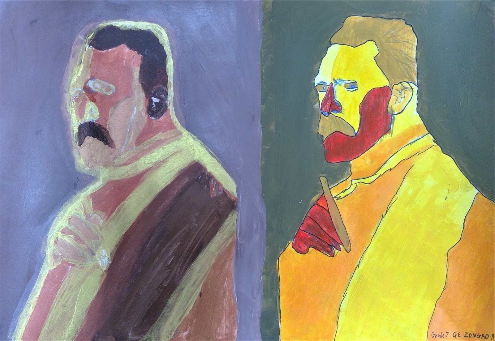
Next we looked at what kinds of portraits were done in the Pop Art movement, and the students were so excited to see the Chairman Mao portrait by Warhol, since we are in China! It really brought together the global implications of Art, and how cross cultural it can be.

Students chose their favorite Pop Culture icon from today or historically from the internet, and I printed them out on A4 paper. They then did a plan in their sketchbooks so that they could work out the color schemes they wanted to use. According to the size of the portrait, they either did 2 or 4 portraits on one sheet of cardstock for their final, summative piece. They could choose a minimum of 2 color schemes, and up to as many as they wanted depending on the number of portraits they could fit on their final paper. Some students ended up with 12 portraits on one sheet!

Challenges:

Language/Vocabulary- It is hard enough to speak two languages, but add in a bunch of Art terminology, and that bar raises exponentially. The students did really well, though!

Time Management: From planning, to the final piece, this unit took nearly 10 weeks, plus a couple more classes for critique and assessment.

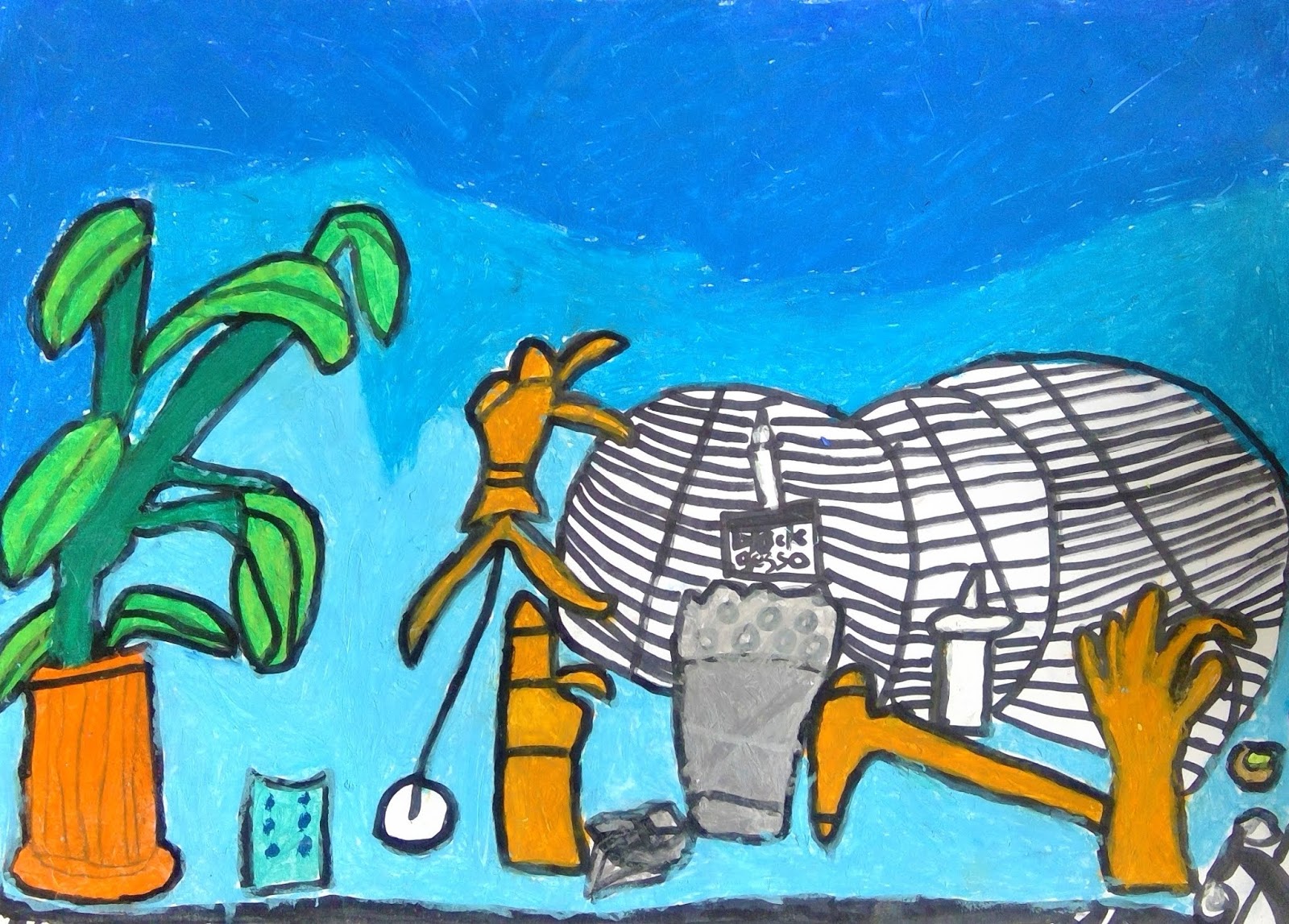
This unit went on waaaaay too long, and by the end, we were all ready to be finished. Even though some of them may not be considered " Pop Art", per se, there were some very interesting things happening at a purely aesthetic level, so I've include 1 or 2 of those. The struggle is real, but here are some images of their amazing work.